Lucid: Moodboard-first AI Travel Planning
Product design
B2C Travel
Master's project

CONTEXT
UW Master’s
project
TIMELINE
4 weeks (April - May 2025)
TEAM
1 UX researcher
1 project manager
2 product designers
MY ROLE
Product design
UI + visual design
Design strategy
OVERVIEW
Context
The travel planning experience is overwhelming - 70% of Americans report feeling stressed when planning a trip. Fragmented information sources force travelers to jump between countless platforms - from social media for inspiration to review sites for validation to booking platforms for purchasing - while generic recommendations fail to fit their travel style + preferences. The result: decision fatigue and hours spent second-guessing choices.
In 2024, 40% of travelers experimented with AI tools for trip planning - and that number is only expected to increase - but nearly half of those who did said they were “unhelpful,” indicating plenty of room for improvement.
40%
of travelers experimented with AI planning tools in 2024, but…
50+%
of those who did said they were "unhelpful"
OVERVIEW
Solution: Lucid
Collaborating with a Kayak PM as part of my HCI graduate work, I reimagined AI-powered travel planning to address a key gap discovered through research: traditional chat-based AI tools provide text-heavy lists that don’t help travelers actually envision their trip. Without rich visual context, users struggle to determine which recommendations align with their preferences.
I created Lucid, a web application that transforms written travel preferences into a personalized moodboard and curated recommendations, allowing users to visualize their trip, validate options through integrated review sources, and book confidently all in one platform.
Express your travel vision in seconds
Share travel goals, preferences, and any confirmed bookings to get started
See your trip come to life
Lucid generates a personalized travel moodboard - from photos to short-form video content - providing you with visual inspiration for your upcoming trip. Edit by uploading media or regenerating with AI
From inspiration to booking
Get tailored recommendations that fit the vibe of your input + moodboard. Easily book, save, and validate recs through integrated review sources.
OVERVIEW
My contribution
As a product designer, I shaped the product vision for Lucid, collaborating with research and product management to ground design decisions in user and business needs. I owned the end-to-end design of the recommendations flow and leveraged my visual design background to establish Lucid's brand identity and design system.
Competitive analysis + design thinking
I translated research insights and competitive analysis into a clear product vision, identifying a critical gap in existing AI travel tools: text-heavy output that fails to help users visualize their trip.
Rapid prototyping
I owned the recommendations flow from concept to high-fidelity, rapidly iterating through 3 rounds of user testing and stakeholder feedback to refine the experience for travelers exploring AI planning tools.
Visual + motion design
I shaped Lucid's brand identity + design system and designed expectation-setting onboarding animations that primed users for the moodboard experience ahead
Business strategy
I partnered with a Kayak PM throughout the project to balance user + business needs, designing the recommendations flow to build trust through review aggregation and AI justification while incorporating booking CTAs aligned with Kayak's revenue model.
PROCESS
Research
Generative research
My teammates I began the project with existing generative research on traveler behaviors around discovery + trip planning. The key takeaways:
Fragmented planning resources cause overwhelm
Trip planning resources are fragmented and travelers typically jump between platforms throughout the process -from social media for inspiration to review sites for validation to booking platforms for purchasing - often resulting in overwhelm.
Travelers want unique, personalized experiences
Travelers find the most meaning + joy from off-the-beaten-path experiences that correlate to their interests + preferences, but these experiences can be hard to discover.
Visual content helps travelers make decisions
Travelers seek out rich, visual content while planning to help them envision their trip and make confident, informed decisions around where to stay and what to do.
Aligning traveler needs with Kayak's business model
To build on generative research and ground design strategy in real business considerations, we reached out to a Product Manager at Kayak who agreed to consult with us throughout the project. He introduced us to Kayak.ai, a newly beta-launched AI travel planning tool from Kayak, and shared insights about Kayak's commission-based revenue model where the platform earns revenue when users click through to book with partner sites. This helped us understand that our design would need to balance user trust and engagement with clear pathways to booking.
Kayak earns revenue when users click on highlighted affiliate links to book through partner sites
Competitive analysis: evaluating Kayak.ai
After our meeting, I delved deeper into AI-assisted trip planning and performed a competitive analysis on existing tools - including Kayak.ai - to gain insight into the current landscape and identify opportunities for improvement, keeping in mind our key takeaways from initial research. I found that across the board, they default to text-heavy lists and generic recommendations, rather than provide travelers with visually rich, personalized output they desire when planning.
The Kayak.ai interface
PROCESS
Design strategy + ideation
Moving from research to design, I identified a core opportunity: traditional chat-based AI tools lead with text-based output but travelers think in images. They save Instagram posts, screenshot TikToks, and collect photos to capture their travel vision, but AI platforms don’t leverage this natural behavior to help travelers plan. What if we flipped the script and started with visual inspiration instead of text prompts?
Chosen concept: moodboard-first travel planning
By enabling travelers to express their trip visually through moodboarding, our solution would…
🎨
Infuse meaning and self-expression into the planning process
🎯
Enable personalized recommendations based on visual input + inspiration
✨
Reduce decision fatigue by establishing a clear vision upfront to filter recommendations
As a team, we explored a variety of high-level interaction models + features for our moodboard-first approach, ultimately landing on a 3-part user flow:
Onboarding - Users share their destination and upload a few pieces of media that capture the vibe of their ideal trip
Moodboard generation + editing - AI generates a travel inspo moodboard based on users’ onboarding input which they can then edit
Get personalized recommendations - AI transforms moodboard into a list of curated, bookable recommendations for flights, stays, and experiences
PROCESS
Prototyping + testing
Low-fidelity prototypes
After fleshing out our concept, my teammates and I created low-fidelity prototypes to test with users. I prototyped the “get personalized recommendations” flow and synthesized data from user testing to identify opportunities for improvement.
Low fidelity prototypes: onboard by uploading media, AI generates an editable moodboard from onboarding input, user gets personalized travel recs that correspond to moodboard
Round 1: user feedback + design iterations
Our main goal for the initial round of testing was to determine the desirability of our “moodboard-first” approach to AI-assisted travel planning and to understand what would make users trust AI-generated recommendations.
01
Friction around uploading media during onboarding
Participants shared that they might drop off during onboarding when asked to upload media as it would require too much effort to search for visual inspo
✅ Improved iteration: Replaced media upload with a text-based input step where users can “brain dump” their trip vision to reduce onboarding friction
02
Users wanted more control over moodboard customization
Participants responded positively to the AI-generated moodboard and liked being able to edit it. However, they wanted more granular editing options beyond what our initial prototype hinted at.
✅ Improved iteration: Added detailed editing controls: users can hover over any moodboard element to delete it, upload their own media to replace it, or regenerate with AI.

03
Too many recommendations = overwhelming
Participants felt overwhelmed by the number of AI recommendations provided to them and wanted to understand AI’s “thinking” behind the suggestions shown
✅ Improved iteration: Shifted to quality over quantity by reducing number of recommendations to 1 flight, 1 stay, and 3 experiences with AI justification for each.
04
Users need to research recommendations before trusting them
Participants expressed that before committing to recommendations, they do additional research by reading reviews and cross-checking ratings from various platforms
✅ Improved iteration: Added review aggregation from multiple sources on each recommendation card to enable cross-checking and help build trust. This also aligned with business goals - by positioning Lucid as a comprehensive planning hub where users could research AND book, we increased the likelihood they'd stay on the platform and click through to booking partners.
Round 2: user feedback + design iterations
My teammates and I conducted a second round of testing with updated mid-fidelity prototypes. Our goals were to continue refining our concept and hero flow based on feedback from travelers and to identify + fix usability issues.
01
Too few recommendations created skepticism
While with our initial prototypes, participants felt overwhelmed by too many AI recommendations, there’s a fine line - by providing only 1 recommended flight, 1 stay, and 3 experiences, they became suspicious that the content being shown to them was sponsored
✅ Improved iteration: Balanced choice and quality by increasing recommendations to 3 flights, 3 stays, and 9 experiences
02
Users wanted to bookmark favorites and see a curated final view
All participants expressed that they would like to save recommendations and see a final “itinerary” with all saved recs
✅ Improved iteration: Added bookmarking, allowing users to save favorites and view all selections in one place
OUTCOME
Visual Identity + motion design
I designed the logo + visual identity for Lucid and collaborated with teammates to develop Lucid's design system, including typographic styles, reusable components and standardized patterns to ensure consistency and scalability.
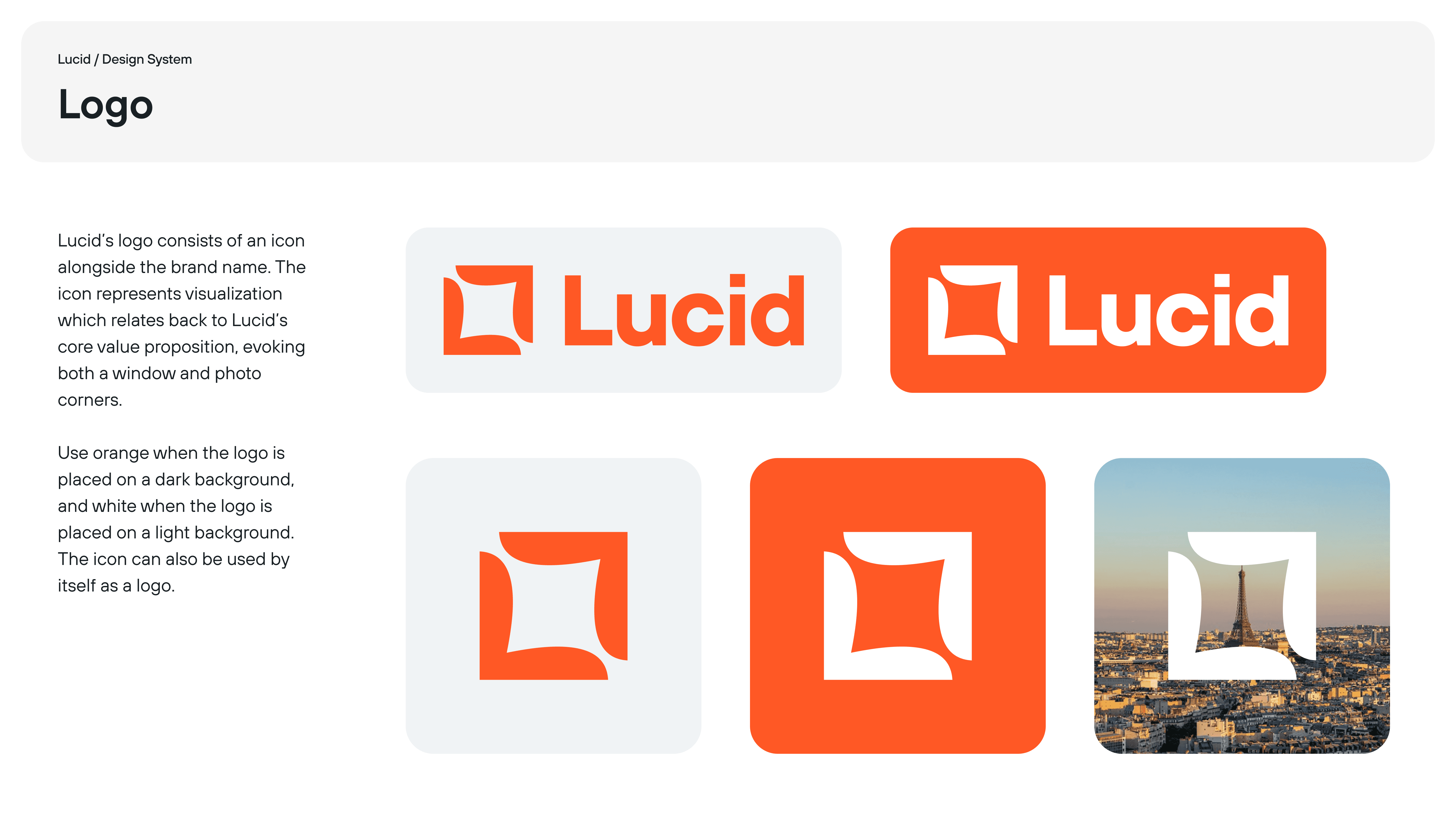
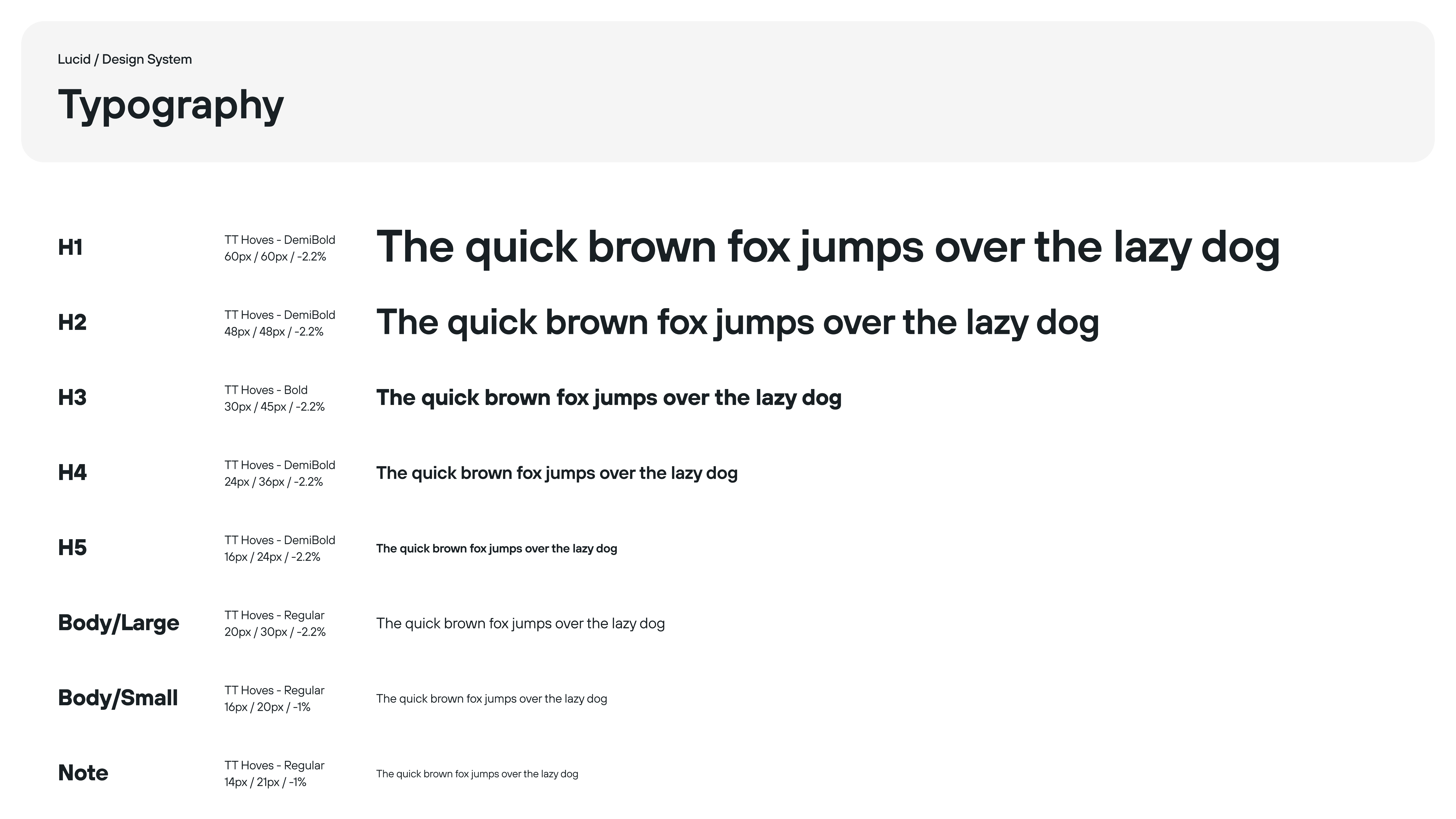
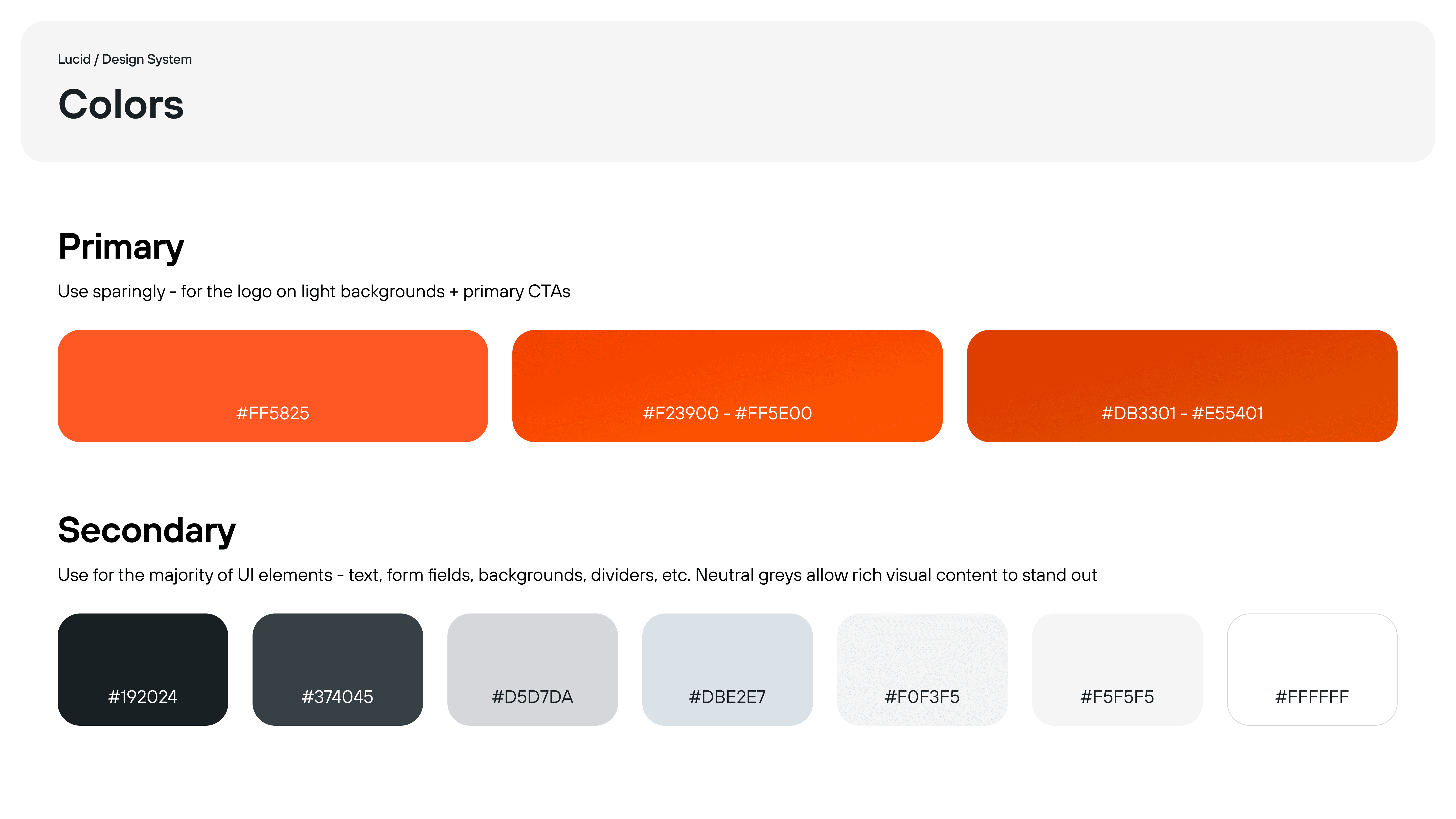
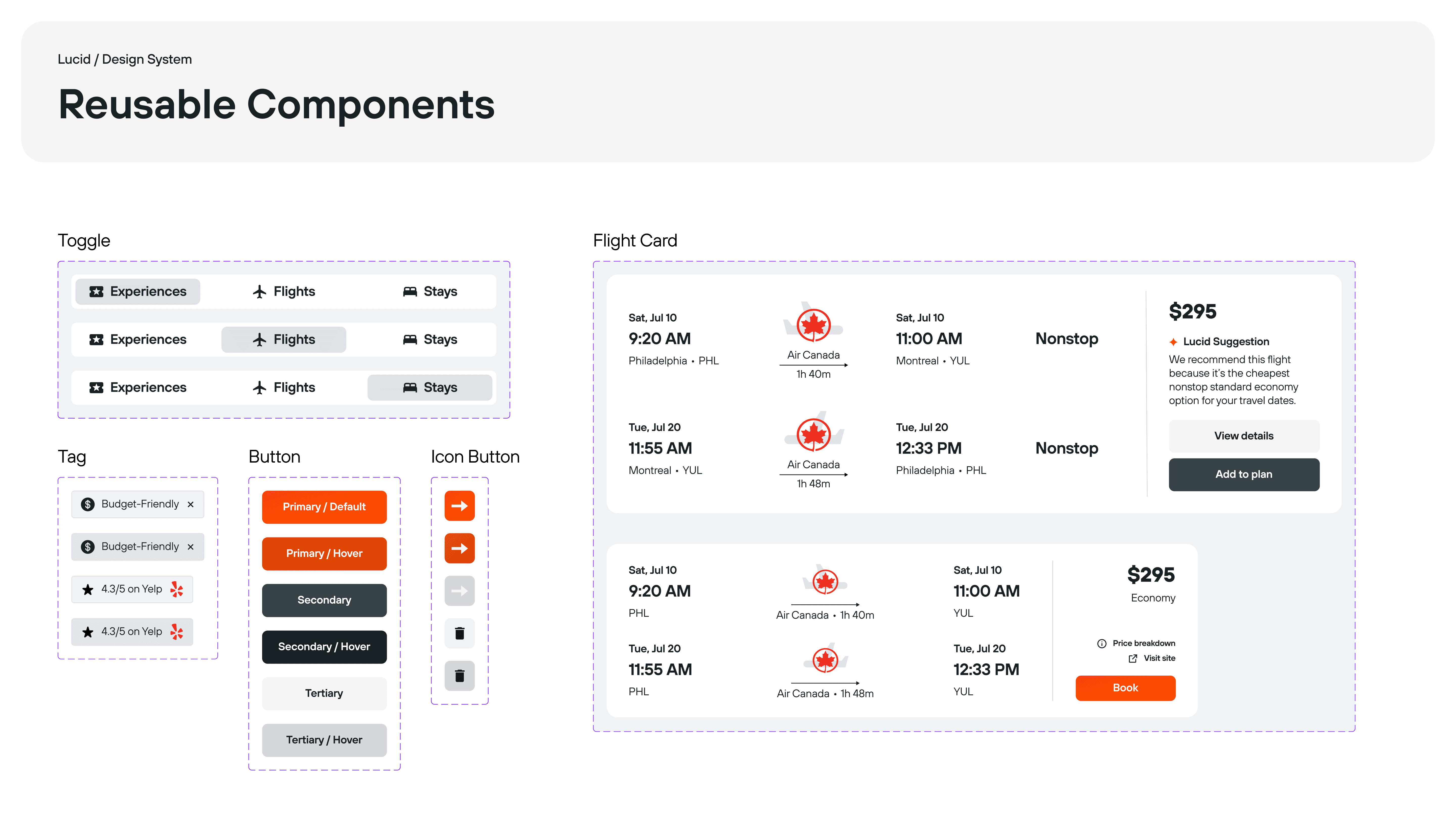
Select components of Lucid's brand identity + design system
Additionally, I designed an expectation-setting onboarding animation to help prime users for the moodboard experience ahead:
OUTCOME
Impact + measuring success
While Lucid wasn't shipped, we validated the concept through user testing. In our final round of testing, 100% of participants said they would use Lucid to help plan their next trip if it were available. Additionally, the PM from Kayak who we collaborated with recognized how Lucid successfully addresses real user needs:
“I could see myself using this. There's not another product like this on the market. It's true that [travelers] want to see visuals, and that's not really a strength of AI tools right now. This solves real problems that users have.”
-Product Manager at Kayak
If Lucid were live, I would measure success through:
Time to first booking (speed of conversion)
Moodboard completion rate (engagement with core feature)
Booking click-through rate (business viability)
User retention (returning to plan another trip)
REFLECTION
What I learned
Designing for user choice + autonomy
During round 2 of user testing, we significantly reduced the number of recommendations to focus on on quality and avoid overwhelming users. The (unintentional) outcome, however, was that participants felt skeptical of the few recommendations that were shown. Additionally, "highlighting" some recs over others in the UI, which we intended as a helpful nudge, caused suspicion of sponsored content. I learned that every detail matters in how users perceive their choice and autonomy when navigating an interface, and to design accordingly!
Sweet spot = where user + business needs overlap
Collaborating with a PM at Kayak reinforced the importance of prioritizing features + experiences that address both user and business goals. It was inspiring to see how Kayak balances the needs of both their booking partners and customers through the click-referral model, where booking partners get traffic directed to their site, and customers get to price-check across platforms - all while Kayak itself earns revenue in exchange for clicks. This project taught me to design at the intersection of user delight and business viability.